Category: Project 1


Evaluation
In this evaluation I’m going to tell you about what I’ve done for my advertisements. This will be a descriptive analysis of my target audience this will include how we first discovered how to use and effectively create an advert, the brand for our advertisement and why we chose that brand, how we used a website to create a mind map to layout our advertisements, our target audiences. age and why I chose said age, there psychographic and their whereabouts, target locations for the photoshoots, how I’ve edited the photos using Photoshop, InDesign, etc throughout this creative process.
Action Plan
For my main five final advertisements i will include photos i have taken from previous outings and graphic designs i have learnt from over the course. they will feature different styles of shoots these include: gritty low angle shots, fisheye lenses,
Target Audience Profile
My key target audience for my adverts are 16 to 18 year olds i chose this age range because this is the average age for skaters to start properly investing into skateboarding. i chose thrasher as its one of the biggest skateboarding brands and people know the brand from many skateboarding magazines. the psychographic range would be explorers as the seek out sensations and adventure and are risk-takers.
With the psychographic i will strive towards taking photos outdoors and around environments where explorers would usually go, this would include: Skateparks, Sub Urban areas and Parks.
Popplet Mind map
I planned out a mind map on a website called popplet this allowed me to write out all my ideas on my choice Thrasher. This helps explain what im planning on doing for my advertisements.

Skatepark Locations
- Revolution Skatepark
- Broadstairs Skatepark
- Ashford Skatepark
- Beachfields Skatepark
- Ramsgate Skatepark
These are some of the skateparks that I can go visit and take photos for My advertising

Advert Target Audiences
My adverts will be based on the skateboard company Thrasher.
The age range for my audience is 14 to 18 year olds
The location will be around the urban/sub-urban’s as most skaters skate there.
There interests will be wanting to start skateboarding/already been skateboarding.
Assignment Brief Breakdown
Deadline: 08/11/2019
Aim: The aim is to produce a series of 5 advertisements across 3 media platforms e.g. Billboards, posters, leaflets etc. for a media product of my choice
Task 1: the main Essential skills for advertising are Composition, Lighting, Digital image manipulation, Typography, Layout design, Use graphic design. i should take screenshots while going though my work.
Task 2: I must show a clear target audience by creating a range of primary and secondary research sources including Questionnaires, online research and to analyse existing advertisements.
Different Types Of Lighting
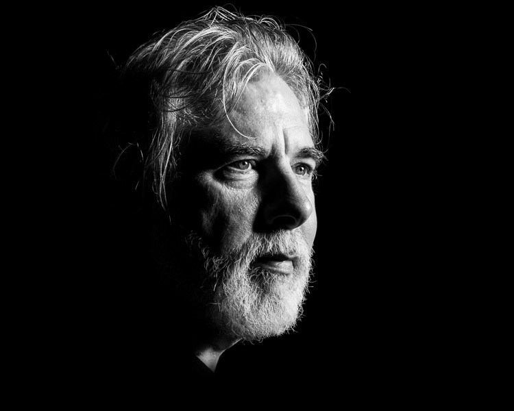
Side Lighting : Side lighting is exposing one side of the face to light which creates a glow on the side the light is shining on the model and a shadow on the opposite side. This can give a dramatic shot

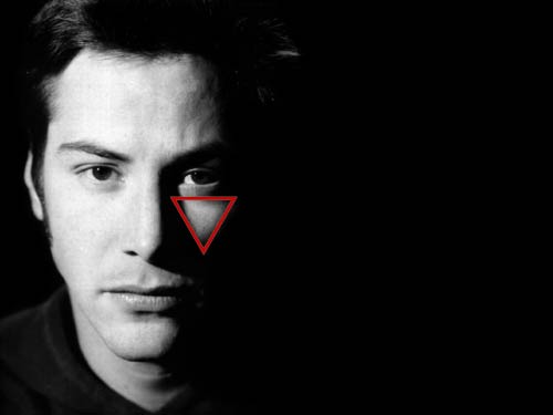
Rembrandt Lighting: Rembrandt lighting is very similar to side lighting apart from there is a small triangle of light underneath the eye of the model. This form of lighting was invented by Rembrandt in his paintings but was incorporated into the photography world and is now well known.
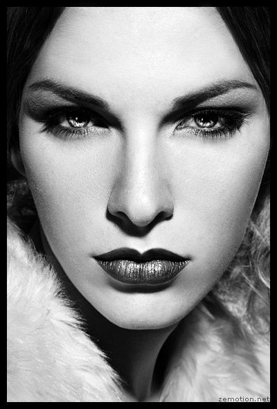
Butterfly Lighting: Butterfly lighting is where the light is at a higher angle than the model so that they can get more features of the models face in more detail. this form of lighting is also known as “Paramount lighting” this is because it’s named for classic Hollywood glamour photography.

Vans Advert

i decided to use this photo since it has a decent amount of negative space on the right side of the photo for the tagline. the composition of the shot has rule of threes with the man and his leg in the shot this also helps the composition of the tagline’s.”OFF THE WALL” is larger than “Worlds Number One Skate Shoe” because of the text hierarchy of the tagline’s. i chose the white colour on the darker part of the concrete as this makes the lettering stand out more to the eyes.
